This is the first in a series of weekly blogs I will be writing about Large Size Replacement Nationals. Peter Huntoon and I wrote an article ("Identification of Series of 1882 and 1902 National Bank Replacement Notes Printed in the 1903-1915 Period") in late June that is published in the September-October edition of Paper Money, which is viewable to registered members. SPMC members who have not yet set up their online accounts can do so here.
The ten second summary is that the BEP used serial numbers with a distinctive "old style" font in the 1903 to 1915 (since updated to 1920) era to make replacement notes. The figure below shows the old style font in the top row and the new style font (used for normal production notes) in the bottom row:
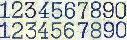
An overall theme with the earlier style font is that the numerals are tighter in appearance. In numismatic parlance, they might be referred to as "closed" and "open" fonts, respectively, reminiscent of the closed and open 3s found on 1873 coinage. The most distinguishable old style numerals are the droopy 2, the hunchback 3 and the long-handled 4.
Note that early Red Seals and most Brown Backs have the old style fonts, but they are not replacements. Refer to the table in the article for the observed serial number changeovers to the new style for regular production notes.
Peter did nearly all of the writing of our article. That is fine by me. I love the way Peter approaches research like this. He pushed me to keep researching while the data I had was still inconclusive, and we have a better paper for it. The hobby is fortunate to have him as a researcher. The SPMC journal Paper Money features numerous articles and columns written by Peter Huntoon, so if you are not yet a member of SPMC, you are truly missing out on the best this hobby has to offer. Click here to join SPMC.
The seeds for this research were sown over a long period of time, and I can’t say exactly when it first started, but I was long aware that two different fonts were used in the serial numbers on Red Seals. They took root about a year ago when I took a day trip up north to visit a friend who deals in post cards (another one of my collecting afflictions). On that trip I visited a coin shop that had some old paper, including a 1914 FRN which caught my eye. I don’t normally buy type notes, but the fonts in the serials numbers where different than I had remembered. Something told me to buy it now and ask questions later, which I did. The story of that trip is one of my earlier blogs. I will say that after the research of this summer, I am confident that the note I purchased is indeed a non-star replacement, but we’ll save that for another time.
After examining the unusual 1914 FRN, I recalled seeing this “droopy 2” style of font on some 1902 Red Seals. That led me to dig a little more deeply into the matter, and I discovered that a changeover of fonts had occurred sometime in 1903, whereby most notes after that time sported the newer, more familiar font. But not all of them. In looking through images from the National Bank Note Census (www.nbncensus.com) and Heritage’s archives (www.ha.com) I found some notes printed after that time which had the old style font. A pattern was emerging, and by April I had a working theory in place. The ability to filter notes by type and by #1 bank serial on the NBN Census greatly facilitated the research.
I had not done much else on the research until the Memphis IPMS in mid-June. I wasn’t even sure I was going to mention it to anyone, but then I ran into Jim Simek, friend and champion of Small Size Replacement Nationals. Here is another researcher who I truly admire. Jim had presented research at the Higgins museum last August, and had just set up a Memphis exhibit showing how to identify replacements. The fact that Jim is so easy to talk to helped open me up, and I shared my theory with him for the better part of an hour. He encouraged me to communicate with Peter, which I did in the form of a Power Point presentation that I hastily put together after returning from Memphis. Peter thought I was "on to something,” and amazingly we had finished a paper within about two weeks.
For those interested in the statistics, so far I’ve gone through about 10,000 images of national bank notes that were issued over the relevant time period. This represents about a quarter of the relevent types in the census; the rest are not yet imaged. Having at this time identified 80 replacements, I extrapolate that there over 300 replacements within the known population of national bank notes. Excluding Red Seals, the overall observed ratio of normal notes to replacements is about 400:1. Because there is a large population of #1 Red Seals (the #1 notes being most commonly replaced), the ratio for Red Seals is in the neighborhood of about 67:1. Over 60% of the documented replacements are #1 notes.
In this series I’m going to show LSRNs by type, one per blog, and fill in some more details as I know them. I’ve started a thread on the SPMC website forum where collectors can report and post images of replacements that they find. I’m building a little type collection of these, and I’ll post my notes there as well.
But to finish this blog, I’ll post an image of the first LSRN that I purchased.


